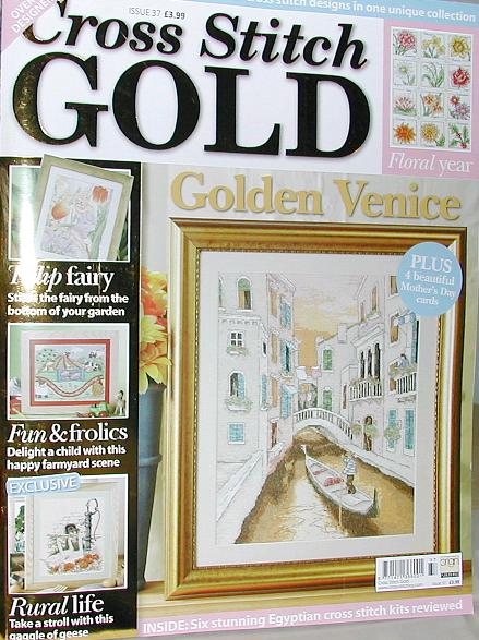
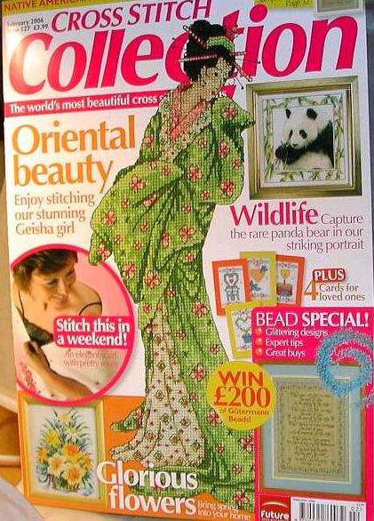
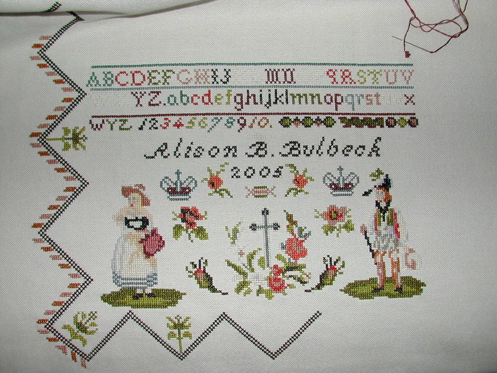
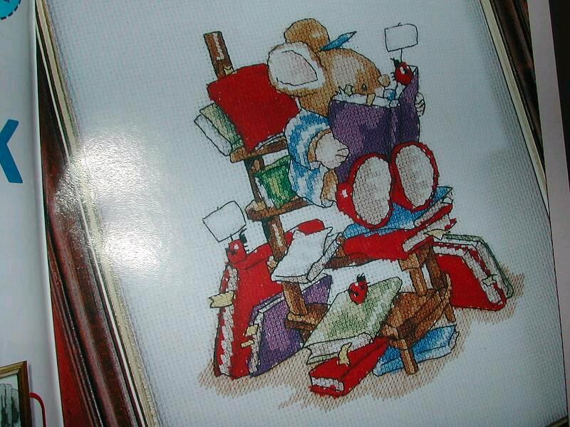
 I thought I would show the contents of Cross Stitch Collection as a pictorial review this month - as they say, a picture paints a thousand words!
One of the reasons I really enjoy Collection is that there are no "gimmicks" - there are no give-aways, freeby kits or gifts on a Cross Stitch theme (you can always buy one of the other magazines if that is what you like) - although occasionally you get a poster sized chart or booklet (next month there is a 12-pager). What you are guaranteed is a magazine full of excellent high-quality designs (then you have the pleasure of going to an on-line store like Sewdiscounted and ordering up all the threads and accessories for the project stash!). In other words, Collection does not need to rely upon cover kits to market its magazine, its quality is its best selling point.
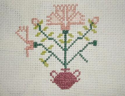
Home Sweet Home is on my to-do list (designed by Cathy Bussi) - I would love to know where the frame can be purchased. I will have to look in the frame shop next week to see if they have something similar. As the magazine suggests, the design can be adapted for Valentine's Day (although it is possibly too late now unless you can get working on it straight away). I just love the folk-art look to it - it would look pretty in our spare room to welcome guests.

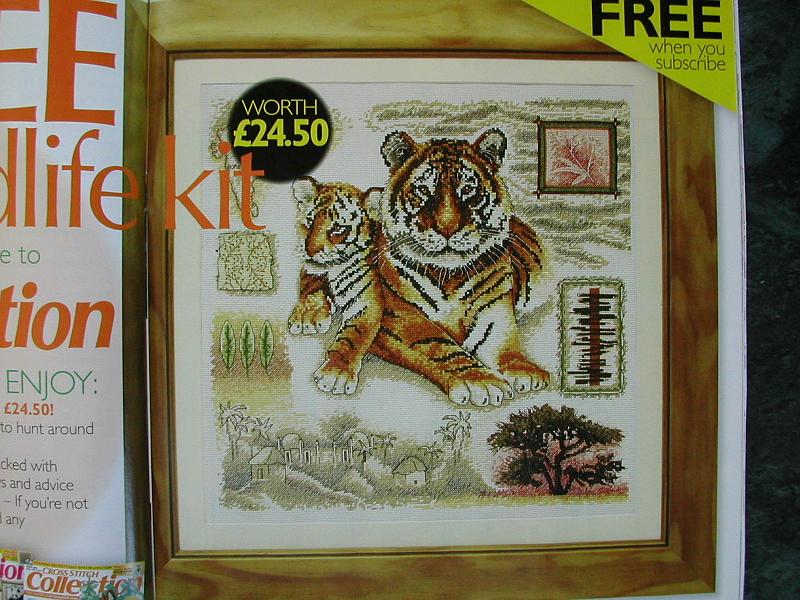
If you read my blog entry yesterday, you will remember the free gift I mentioned of the Wildlife kit - it is shown below. I think it is something that would be worth taking out the subscription for, as it is a beautiful design for a gift or to keep.
I
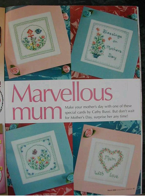
Cathy Bussi's pretty and very feminine cards would be perfect for Mother's Day or even a friend's birthday.
I admit, there are a couple of designs I did not really like this month - Lesley Teare has produced a two-part set This month it is an Oast House, which is a typical style house in Kent, East England. These houses are round shaped and were typically for storing grains and hops for beer, although people lived in them too. The second in the series will be published next month and is a windmill - again a typical country style scene. Although both designs are pretty, I am not so keen on the harsh blocks of colour and lack of real dimension. In my opinion, Lesley is better at botanics (such as the lavender sampler I have on our kitchen wall) than buildings!
Diane Machin has designed a chart called Goddess of Love (the Roman goddess Venus). The border is very pretty, pillars in turquoise blue, with roses growing up round them. My problem is with Venus' face - she is meant to be beautiful, but I think she looks rather ugly, with brown "blobs" for eyes and shocking red lips rather than the softness and beauty I associate with her as a mythical icon from the sea.
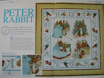
Last and by no means least - the Peter Rabbit chart. I don't really need to describe it (see the photo below!), it is amazing and thoroughly deserves the prime spot in the magazine. It is designed to be made into a clock and has wonderful scenes of Peter that are too adorable for words!


